

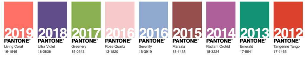
January is full of new beginnings and declarations. For the creative community, one highly anticipated declaration is the Pantone Color Institute’s announcement of the color of the year. Pantone recently unveiled the color of 2020: PANTONE 19-4052 Classic Blue.
Classic Blue Symbolism
The Classic Blue color is described by Pantone as having “reassuring qualities,” being “thought-provoking,” and reflective of “our desire for a dependable and stable foundation on which to build as we cross the threshold into a new era.”
“Associated with the return of another day, this universal favorite is comfortably embraced,” it added.
While 2019’s color, Living Coral, was “animating and life-affirming,” 2020’s shade “brings a sense of peace and tranquility to the human spirit, offering refuge,” according to the company.
Color of the Year Industry Use
For over 20 years, Pantone’s Color of the Year has influenced product development and purchasing decisions in multiple industries. The color will quickly begin to dominate fashion, home furnishings, industrial design, product packaging, and graphic design.
How the Color of the Year is Chosen
According to Pantone, “The Pantone Color of the Year selection process requires thoughtful consideration and trend analysis. To arrive at the selection each year, Pantone’s color experts at the Pantone Color Institute comb the world looking for new color influences. This can include the entertainment industry and films in production, traveling art collections and new artists, fashion, all areas of design, popular travel destinations, as well as new lifestyles, play styles, and socio-economic conditions. Influences may also stem from new technologies, materials, textures, and effects that impact color, relevant social media platforms and even upcoming sporting events that capture worldwide attention.”
Color values
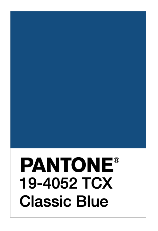
To use Classic Blue digitally, Pantone provided the following values:
| RGB | 15 / 76 / 129 |
| HEX / HTML | #0F4C81 |
| CMYK | 100 / 76 / 25 / 0 |
You will be amazed at the amount of Classic Blue you begin to see as you shop in the coming months. It will dominate products, clothes, and interior designs. Keep your eyes open and report back on your classic blue sightings. In the meantime, I’m going to go paint with some blues.
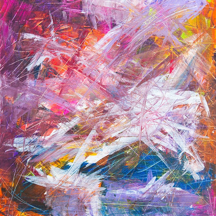
Art Journal Title Page
I did my best to mix Classic Blue. Check out my process video making the title page for my new bullet art journal. What do you think? Did I get close to the right blue color?


1 Comment. Leave new
I design and create jewelry with semi-precious stones and sterling silver — I find that jewelry popularity does follow the colors of the year… this one will be interesting to use. Maybe kanite stones will work best.