

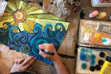
Ah, summer. Relaxation, long warm days, sunscreen, bug spray, jumping in the water, laughing, grilling, camping, hiking, delicious fruits, lighter faire, no school stress, road trips, and the beach. Summer is easily my favorite time of year. As it comes to a close, I always feel a bit sad. In an attempt to put my feelings on paper, I created a mixed media art journal page celebrating summer. As I created, I let the camera roll to capture all the artsy summer goodness.
Process Video
Process Notes
I call this a faux stained glass technique. The video demonstrates the entire process, but it is also outlined below. To create a similar effect:
Step 1 : Black Gesso
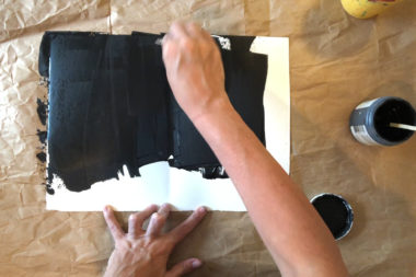 Paint the entire background with black gesso and let it dry completely. I used an old credit card to quickly cover the entire surface.
Step 2: Draw the Composition
For the faux stained glass technique, I recommend a landscape. The important items to identify are the background and foreground keeping in mind the rule of thirds. The foreground, middle ground, and background divide a landscape into different planes that the artist normally uses to create a sense of depth. The background is the part of a landscape that is furthest away. 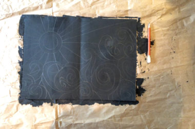 It often has the least amount of detail and the least saturated colors. The foreground consists of the largest items closest to the viewer. It often has the most saturated colors and the most detail. The middle ground is everything in between. For the faux stained glass technique, the foreground and background are used to create contrast rather than depth.
Rule of Thirds
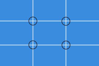 The rule of thirds is very important to consider when you create your compositions. Divide your page or substrate into 9 equal parts. It helps me to envision an invisible tic-tac-toe board atop my work. Your artwork’s focal point should be on one of the intersecting points . A horizon line drawn a third from the top or a third from the bottom tends to create a more effective composition than one right down the middle of the page.
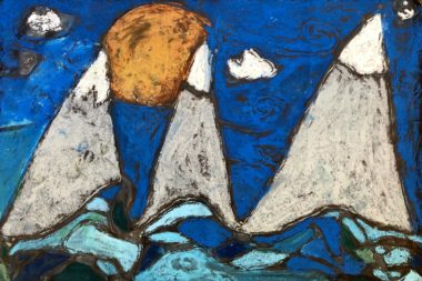
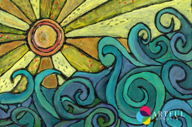
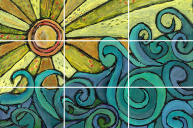 In this example, I put the center of the sun near the top left intersecting point. I have the horizon line move diagonally from the bottom third on the left to the top third on the right. The water is in the foreground and the sun is in the background.
Closed vs. Open Shapes
Lastly, it is important to use closed shapes. Closed shapes are enclosed from all the sides, end-to-end, and form a figure with no openings. Think of a real stained glass you’ve seen. You don’t want large sheets of glass that are all one color; you want many small pieces of glass in varying colors. So, when drawing your composition, break up any large shapes into multiple smaller shapes. For example, in step 3, the example from the class I taught has a large open space for the sky. With some overlapping clouds or swooshing wind, it could have been broken up into more closed shapes.
Step 3 : Glue lines
Hot glue or regular white school glue can work as long as it dries clear and raised. I actually taught this same technique to 3rd graders and they created masterpieces with Elmers glue on black construction paper. It had to dry overnight and then they colored it in with oil pastels. The results were gorgeous as you can see from the mountain scene example from the class.
Step 4: Paint
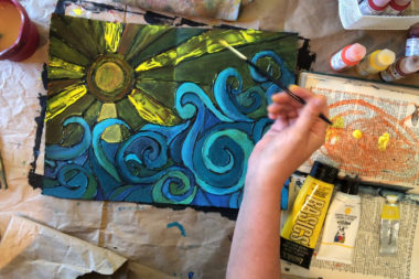 Choose an analogous color scheme. Analogous colors are groups of colors that are next to each other on the color wheel, sharing a common color. For the waves, I use blues, greens, and purples. Paint intuitively, adding colors where it seems they should go and mix the paint right on the page as you paint. For the sun, I used the analogous color scheme of yellows, reds, and oranges.
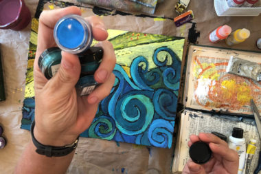
Remember the properties of paint as you choose what to use. Acrylic inks, watercolors, and fluid acrylics are quite transparent. Heavy bodied acrylics are more opaque. I started with the most transparent media and then built up the layers to the level of saturation and opacity I liked. Any time you want to make a fluid acrylic more opaque, you can add white paint to it. Note that the color will, of course, become a tint of the original hue.
Step 5: Mix Your Media
 What other art supplies do you have lying around? What did you buy forever ago and you never use? Get it out. Almost anything goes. In the demo I used fluid acrylic paints, acrylic inks, heavy bodied acrylics, and Twinkling H20’s Shimmering Mica Watercolors. Lastly, I used oil pastels. Oil resists or repels other media, so always save it for the last layer unless you’re attempting a resist technique.
Step 6: Mark Making
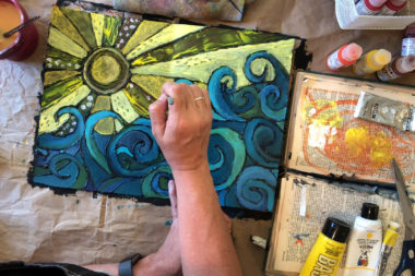 The mark making is what always gives an art piece the polished, completed look. Watch the video demo to see several mixed media techniques for mark making including scratching the paint with sharp implements, using a chopstick to make dots, making use of old gift cards / hotel keys, and adding a final pop of color and pattern with oil pastels.
Step 7: Redefine the Black Lines
 To complete the faux stained glass look, go back over all the glue lines with black. I tried a large black sharpie, a Prismacolor black marker, and a Posca black acrylic marker. The Sharpie and Prismacolor did not do well over all of the media on the page. The Posca black acrylic marker worked beautifully. Any time it began to lose effectiveness, I was able to shake it and get the paint flowing again.
Step 8: Seal the Final Piece
 After I finished this art journal spread, I knew I had to seal it. Without sealing, the oil pastel will get all over everything and the page might tragically stick shut if closed in the book. I used Krylon Workable Fixatif to seal it. Fixatif is technically for use to hold powdered pigments so they do not smear. I have found that it also works well as a spray finish for mixed media art journal spreads. It dries clear, non-tacky, and sets the media on the page just enough to not smear or stick in my journal.
Art Journal Prompts
How can you put this faux stained glass technique to use in a meaningful way? Try one of these 10 ideas for landscapes you can include in your art journal:
- Close your eyes and picture your happy place. Envision the place as though you are standing there. Then, open your eyes and sketch it quickly.
- Find a landscape photo from your most memorable vacation.
- Open a magazine and look for interesting places that you would like to visit.
- Use a photo or your memory of your childhood home. A landscape doesn’t have to be mountains and beaches.
- Take a photo of your current home from across the street.
- Go for a hike. Take photos of inspiring, beautiful natural views on your walk. It doesn’t have to be a breathtaking vista; it might just be a cluster of flowers.
- Think of your favorite season. Make a list of 10 things you love about that time of year. Choose one as a topic for your page.
- Think of your favorite book from your childhood. Create the setting.
- Listen to the radio for 5 minutes and tune in to the lyrics. Conjure an image to journal.
- Think about the mountains, the beach, the country, and the city. Which one is your favorite? Create a page to honor that part of you.


16 Comments. Leave new
Wow, that took a lot of work to video and create. I am fascinated, thank you.
I love all things art. It is my life’s blood, and I really enjoyed not seeing just the beautiful artwork that you created here, but all the time it took to make it. Absolutely stunning!
Thanks, Kristen. I always find watching process videos enlightening for the same reason — seeing the time and the amount of layers, etc… is always interesting. Thanks for stopping by.
I love being creative and watching others create as well! Great job, keep up the great work!
This is an excellent step by step guide to create your own artwork similar to the one above. Very inspiring!
Such a beautiful image, I will miss the summer so it’s
the great idea…
Your creativity and prompts are inspirational. Thank you for walking us through the steps to creating to creating journal entries.
What a beautiful picture and an inspiring and informative post. Thank you so much! <3
Thanks, Sue 🙂
[…] — Or see this full video tutorial on making a summer themed page. […]
Thank you so much for showing your process! Beautiful piece.
What a wonderful technique. Thank you so much. I’ve enjoyed seeing your other videos as well.
What an absolutely gorgeous process!! Thank you for sharing!
This was so much fun to watch! What a great technique, too! I look forward to giving this one a go. Thanks for the journal prompts. The next time I’m stuck, I’m going to use this list to create from!
Like the glue lines idea!
How much fun was that! Definitely giving the hot glue gun a go on my pages now.