

Art Journal Round Robin Origins
In 2015, I excitedly became a founding member of an art journal round robin group. The other founding members of our group are Paula, Donna, Claire, and Tamala. Leah joined our group in the second round. We are all family members, colleagues, and friends of the organizer, Paula.
Check out Part 1 of the Art Journal Round Robin series to see the first book we completed and how to make the actual journal.
Part 2 of the Art Journal Round Robin series shows the second book we completed based on a materials theme.
See Part 3 of the Art Journal Round Robin series for the third book we completed based on children’s literature.
Recap of the Art Journal Round Robin Rules
We work in our own journal first, decorate the cover, establish if we want a theme, and then create one internal spread before sending it to the next artist in rotation. That artist then has a month to create art in a blank spread of your book, before sending it on to the next artist in rotation. In the meantime you receive a book from another group member. You work on that book, finish a spread, and send it along. The order of artists never changes to ensure each book receives a contribution from all of the members before returning to its initial creator. Our schedule was to send by the 7th of the month. Eventually, each artist receives their own book back full of art work created by every member of the group.
Rainbow Theme
 Just before I began to work on the my fourth journal, I happened to be reading Julie Fei Fan Balzar’s blog and saw her mix and match faces. She inspired me; so, I created my next journal and used a ruler to tear all of the pages so that each page showed a portion of all of the pages that come after it. Then, I painted each page a base color in rainbow order: red, orange, yellow, green, blue, indigo, and purple. The base acrylic layer forced some people out of their comfort zones and stretched their creativity to cool heights. Here’s what it looked like just before I mailed it off.
How Each Artist Handled the Theme
Boomer (me): Cover
 As I painted the base color on each of the interior spreads, I used a credit card to scrape some color off on the front and back cover of the book. When I packaged it up for mailing, I included a note asking each artist to contribute something to the cover in addition to completing an art journal spread. The desired result was for the cover to be a colorful, eclectic collaboration piece. We then signed the back cover and dated it.
It’s interesting to see what each person contributed. I could name the artist from each component almost immediately which shows how familiar we’ve become with each other’s work. See if you can determine which element each artist added after you see the finished art below.
A little typography will finish this off nicely. If I add a large title in the space above the butterfly and to the left of the flower, it’ll all come together.
Red: Boomer’s Challenge

Still inspired by Julie Fei Fan Balzar’s pages that sparked this entire journal theme, I created a portrait on the red page. It was my first attempt at a 3/4 face so she could look at all the art to come. She’s incredibly loosely colored. I was traveling when I finished her, so I only had a limited amount of art supplies with me. She ended up kind of loose and roughly illustrated, but it doesn’t bother me. In fact, I really like her colorful her skin tones.
The quote, “Live a colorful life” essentially set the tone and issued the challenge to the contributing artists.
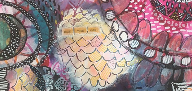
Orange: Boomer’s Punk

Each artist had the perogative to choose whatever color spread they wanted. There were only 5 other artists in the group at that time, so one spread would not be chosen. No one chose the orange spread. I don’t know if they didn’t like the color or the fact that it was the smallest deterred them. Regardless, when the book was returned to me, the orange spread was empty.
Visually, I love orange and pink together, so I played with that color scheme. The base layer is an intuitive mixture of colors and patterns. Then, I used Dina Wakely’s Moon Face stencil (no longer available) and paired it with a Stencil Girl stencil to create this spread celebrating individuality. I love the colors, the characters, and the message of this spread. It was meant to be that the orange spread came back to me.
Yellow: Leah’s Lady
 Leah went far outside her comfort zone with this piece. Whereas she normally used all colored pencils, she used acrylic paint. She also did a seated stylized figure as opposed to a more realistic interpretation. I love her use of yellow’s complimentary color, purple, and the demure expression of the woman. The flowers on the table are done is a super cool and loose style, too. They add such interest and really contribute to the tone. Lastly, her use of pattern is really great.
Green: Donna’s Textured Quote
 Donna really embraced the green. She topped the base layer with tons of texture starting with the Moroccan tiled stencil in a deeper green. Quite subtly, she also stenciled floral patterns and leaves in three corners which she topped with brown brick, possibly created with crackle medium. Then, for the topmost layer, she used texture paste to stencil on words and the blue rose. Afterwards, it looks as though she colored the words with a brown ink pad, and possibly sprayed the color on the rose as a finishing touch.
Blue: Tamala’s Zentangled Butterflies

Tamala clearly saw the blue as a sky. It inspired her to zentangle 7 butterflies (one on the cover). Each of them has unique patterns and designs. They are intricate and beautiful. The butterflies are attached with xxxxx, so they look as though they are levitating over the page. To add to the dimension, she painted in a grey shadow beneath them. Making them look as though they are truly flying, she dripped which paint beneath the butterflies and added a black and white bakers string for movement. The journaling is a passage from J. Raymond about change, flying, and becoming comfortable with yourself.
“A butterfly whose wings have been touched, can indeed still fly…She would soak up the sun, kiss the breeze, and she would fly.”
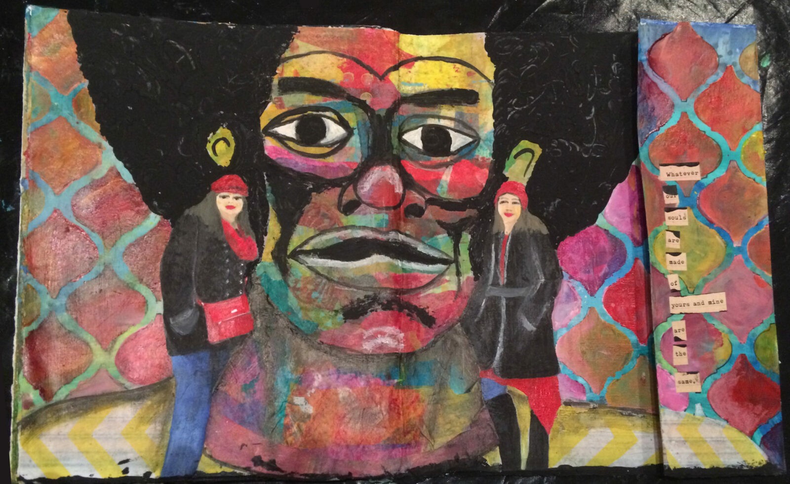
Indigo: Paula’s Portrait

Paula kept one small indigo stripe showing as her peek-a-boo element, and created an otherwise multi-colored masterpiece. The background geometric mosaic is set off by the iridescent gold borders around each shape. The face is gorgeously collaged with hand-painted papers glued down in such a way that preserves the shadows, highlights, and proportions of the portrait. Then, setting the background apart from the face, she painted multiple values of brown in the hair and added a large flower element to draw focus.
Purple: Claire’s Praise & Patterns

Claire took on the largest pages in the book, the purple spread. She created a striped pattern on the background that is so seamless, I don’t know which one is the original color. And, although she included other colors, the spread is overall very purple forward. Atop her stripes, she white heat embossed a feather on the left page. Using her hand lettering talents, she added a bible verse using a Uniball Signo white and gold pen. On the right side, she either sprayed or pounced white through a stencil and then selectively chose some circles to color using chalk pastels.
Video Flip Through
Here is a quick flip through of the entire journal. I hope you’re able to see some of the texture and luminosity that the photos don’t capture.
If you have friends, family, colleagues, or other artists that would be up for this, I highly recommend it. I have 6 completed journals and we currently are in the midst of the 7th round. I shared the first journal, the second journal, the third journal, the fourth here, and in the coming weeks/months, I’ll share some of the others.
Do you have any favorites from this journal? Let me know in the comments.


5 Comments. Leave new
[…] supplies they required? Check out my Art Journal Round Robin series: Part 1, Part 2, Part 3, and Part 4. To see a way to mix art journaling and bullet journaling in your own DIY planner, check out my […]
I absolutely love this idea! This would work for my teens art friends during the summer and fall when things are a little slower. Thank you!
I like the cover, Donna’s Textured Quote, and Claire’s Praise and Patterns the most!
I love this idea of a collaborative, traveling journal! I feel so inspired after reading your post to do one of my own with my friends!
I love this. I love art journaling on YouTube I just can’t draw I love to be more creative. You guys very talented that crazy that no one like orange spread.