

Art Journal Round Robin Origins
In 2015, I excitedly became a founding member of an art journal round robin group. The other founding members of our group are Paula, Donna, Claire, and Tamala. Leah joined our group in the second round. We are all family members, colleagues, and friends of the organizer, Paula.
Check out Part 1 of the Art Journal Round Robin series to see the first book we completed and how to make the actual journal.
Check out Part 2 of the Art Journal Round Robin series to see the second book we completed based on a materials theme.
Recap of the Art Journal Round Robin Rules
We work in our own journal first. We decorate the cover, establish if we want a theme, and then create one internal spread before sending it to the next artist in rotation. That artist then has a month to create art in a blank spread of your book, before sending it on to the next artist in rotation. In the meantime you receive a book from another group member. You work on that book, finish a spread, and send it along. The order of artists never changes to ensure each book receives a contribution from all of the members before returning to its initial creator. Our schedule was to send by the 7th of the month. Eventually, each artist receives their own book back full of art work created by every member of the group.
The Cover Makes the Theme
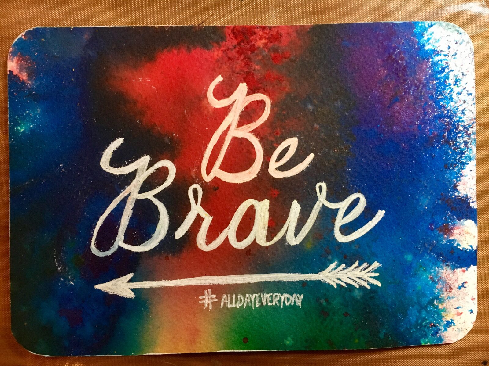
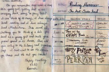 As I began to work on the cover of my third journal, a theme fully developed: create a spread based on your favorite childhood story. I created this internal spread with directions and a library card themed signature page. Not until I put this post together did I realize that Leah forgot to fill out the library card. I’ll have her do that next time I see her. As you can see, some media has leaked onto this page at some point during its journey. Those things happen often. One can’t feel precious about the book and send it around the country for the better part of a year.
How Each Artist Handled the Theme
Boomer (me): Cover
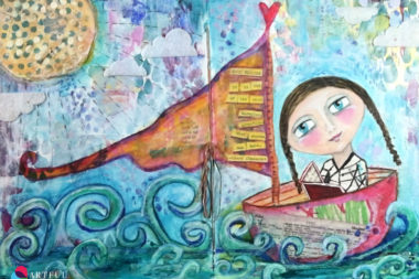 This multi-layered cover started with character development. Next, I began the collage layer. Ripping pieces of my children’s artwork to include really personalized this piece and made it feel more childlike. I then added layers of acrylic paint, Caran d’Anache Neo color II crayons, stencils, black pen, and topped it all off with felt clouds cut out using my Sizzix Sidekick. I found a quote I like about reading and used a Faber Castell Pitt Pen to tint it to match the layout. After cutting each word out, I collaged it onto the sail.
Boomer: Harold and the Purple Crayon by Crockett Johnson
Harold and the Purple Crayon by Crockett Johnson is a great adventure story about a young imaginative artist. Armed only with an oversize purple crayon, young Harold draws himself a landscape full of wonder and excitement. Harold and his crayon travel through woods and across seas and past dragons before returning to bed, safe and sound. I remember repeatedly checking this book out of the library as a girl and bringing it home to enjoy.

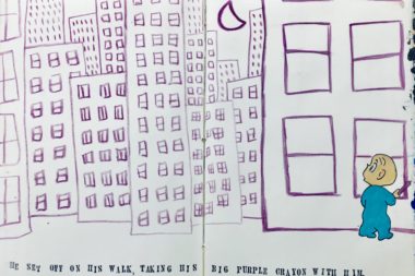
For my internal art journal spread, I looked at my daughter’s copy of the book, borrowed her purple crayon, and copied one of the illustrations. Emulating the simplicity of the original illustrations, the only supplies I used were a black pen, some alphabet stamps, ink, a small amount of acrylic paint, and a purple crayon. Although I really loved the simplicity of this spread, I also loved how fast it was to create. To meet the monthly mailing deadline, I had to knock this page out pretty quickly.
Claire: James and the Giant Peach by Roald Dahl
James accidentally drops some magic crystals by the old peach tree and strange things start to happen. The peach at the top of the tree begins to grow, and before long it’s as big as a house. Inside, James meets a bunch of oversized friends—Grasshopper, Centipede, Ladybug, and more. With a snip of the stem, the peach starts rolling away, and the great adventure begins!

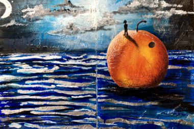
When I saw Claire’s masterpiece, I literally gasped. She did an amazing job capturing the essence of the story and creating an impactful mixed media artwork. The dark horizon creates a great sense of depth and the shading on the peach does a nice job making it dimensional. Bits of silver foil in the water truly shimmer as you look at the page. (In the short video below, you can see the glimmer effect.) I wish you could see the level of texture Claire managed. It’s an all-around gorgeous piece and a true ode to the magic of the original tale.
Donna: Strawberry Girl by Lois Lenski
The land was theirs, but so were its hardships. Strawberries — big, ripe, and juicy. Ten-year-old Birdie Boyer can hardly wait to start picking them. But her family has just moved to the Florida backwoods, and they haven′t even begun their planting. “Don′t count your biddies ′fore they′re hatched, gal young un!” her father tells her. Making the new farm prosper is not easy. There is heat to suffer through, and droughts, and cold snaps. And, perhaps most worrisome of all for the Boyers, there are rowdy neighbors, just itching to start a feud.

As you may or may not be able to read in her journaling, Donna said she chose this book because, “my 4th grade teacher, Mrs. Brooks, read this book to our class after lunch each day. I was totally captivated as I had never heard this type of slang…I bought the book to read to my boys [later in life].”
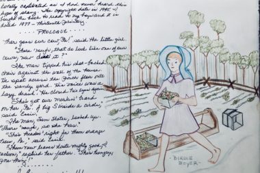
Donna did an amazing job putting the journaling into the art journal spread. She explained her connection to the book and included an excerpt from it. She then used colored pencils to illustrate the cover of the book. After receiving 6 journals with Donna’s art in it, I can easily note this as a departure of her style. In no other art journal did Donna illustrate or draw a scene. If you look back at the first journal and second journal, you can see Donna tends to create a quote with texture paste atop a mixed media background. I love how a theme inspires the artists to take on a different type of art.
Paula: Harry Potter by J. K. Rowling
Harry Potter is a series of fantasy novels written by British author J. K. Rowling. The novels chronicle the lives of a young wizard, Harry Potter, and his friends Hermione Granger and Ron Weasley, all of whom are students at Hogwarts School of Witchcraft and Wizardry.

“Even though I was an adult when I read Harry Potter, it spoke to me. It’s the kind of story that you think of in real life…wishing you could unlock doors or levitate or whatever… I was sad when the 7 volume series ended, so I had to pick Harry Potter as my favorite kids book,” Paula said.
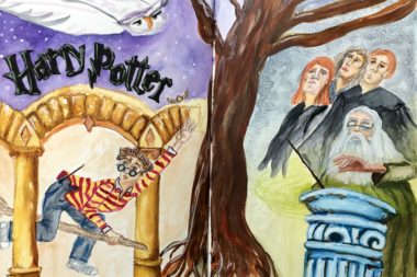
Paula really did a great job on the composition in this spread. She seamlessly incorporated multiple settings, characters, and symbols. I love how she portrayed her own interpretations of the characters and included elements of the story in the piece, too. I had to ask which book from the series this represented, but it’s a conglomerate of several books. Super creative. Also, shout out for the cool 3d lettering.
Tamala: Peter Pan by J.M. Barrie
The character of Peter Pan first came to life in the stories J. M. Barrie told to five brothers — three of whom were named Peter, John, and Michael. Peter Pan is considered one of the greatest children’s stories of all time and continues to charm readers more than one hundred years after its first appearance as a play in 1904.
“As a child, I loved the adventures of Peter Pan…the pirates, Tinkerbell, escaping danger…but as an adult, I relate to the child-like innocence that you can do anything if you can imagine it,” Tamala said.
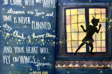
Tamala loves typography, so this is right up her alley. Isn’t the quote beautifully done? One of the coolest parts of her art journal spread, though, is tough to see in the photo. The background of the entire spread is textured with overlapping strips of tape. It has a real shiplapped feel to it. Tamala then expertly blended paint colors atop the tape background to make the house seem like it was covered in an inky night background. The color mixing in the lit window is gorgeously done, too. The pale colors contrast nicely, they evoke warmth, and yet they have a lot of variety. Lastly, the window frame is collaged on which gives it some cool dimension. Oh! And what kind of magical depiction would it be without some glitter? Tamala did not disappoint.
Leah: Nancy Drew by Carolyn Keene
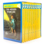 Nancy Drew is a fictional character, a sleuth in an American mystery series created by publisher Edward Stratemeyer as the female counterpart to his Hardy Boys series. The character first appeared in 1930. The books are ghostwritten by a number of authors and published under the collective pseudonym Carolyn Keene.
“Nancy Drew was my first grown up story,” Leah said. “Once I learned the characters, I couldn’t get enough rough and tumble adventures with girls being bold and forceful. This series was my “flashlight under the cover” kind of book.”
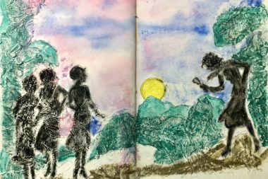
Leah used several interesting techniques to evoke mystery and add texture to the page. She glued crumpled tissue paper to the background to add the forms and texture of the foliage and ground cover. She also chose to only include a silhouette of the characters, yet it is 100% recognizable as Nancy Drew. For the sky, she used a watercolor wet in wet technique and the foreground appears to be colored with Neocolor II crayons or oil pastels. I love the mixed media approach!
Video Flip Through
Here is a quick flip through of the entire journal. I hope you’re able to see some of the texture and luminosity that the photos don’t capture.
If you have friends, family, colleagues, or other artists that would be up for this, I highly recommend it. I have 6 completed journals and we currently are in the midst of the 7th round. I shared the first journal, the second journal, the third here, and in the coming weeks/months, I’ll share some of the others.
Do you have any favorites from this journal? If you had to contribute, what book would you choose and why?

4 Comments. Leave new
[…] Want to see some sample art journal pages and the supplies they required? Check out my Art Journal Round Robin series: Part 1, Part 2, and Part 3. […]
[…] If you’d like to see some samples, check out: — Art Journal Round Robin 1 — Art Journal Round Robin 2 — Art Journal Round Robin 3 […]
[…] book of worship to explore the meaning of a passage. Essentially, it’s the same concept as a thematic art journal with your religion as a theme. Just as discussing a religious passage helps you have a deeper […]
[…] Part 3 of the Art Journal Round Robin series for the third book we completed based on children’s […]