

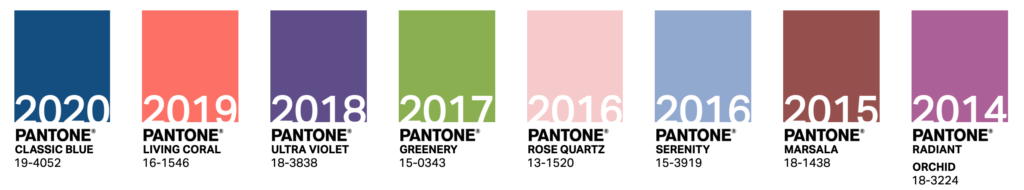
For the creative community, a highly anticipated declaration includes the Pantone Color Institute’s announcement of the color of the year. In a surprise move, Pantone chose two colors for 2021: PANTONE 17-5104 Ultimate Gray and PANTONE 13-0647 Illuminating.

Yellow & Gray Symbolism
Pantone described the chosen yellow and gray as independent but complementary, representing a theme of unity and mutual support. Whereas PANTONE 13-0647 Illuminating is bright and vivacious, PANTONE 17-5104 Ultimate Gray is firm and dependable, the marriage of which represents strength, optimism, and fortitude following a markedly challenging year.
“A message of happiness supported by fortitude, the combination of PANTONE 17-5104 Ultimate Gray + PANTONE 13-0647 Illuminating is aspirational and gives us hope.” PANTONE wrote on their blog.
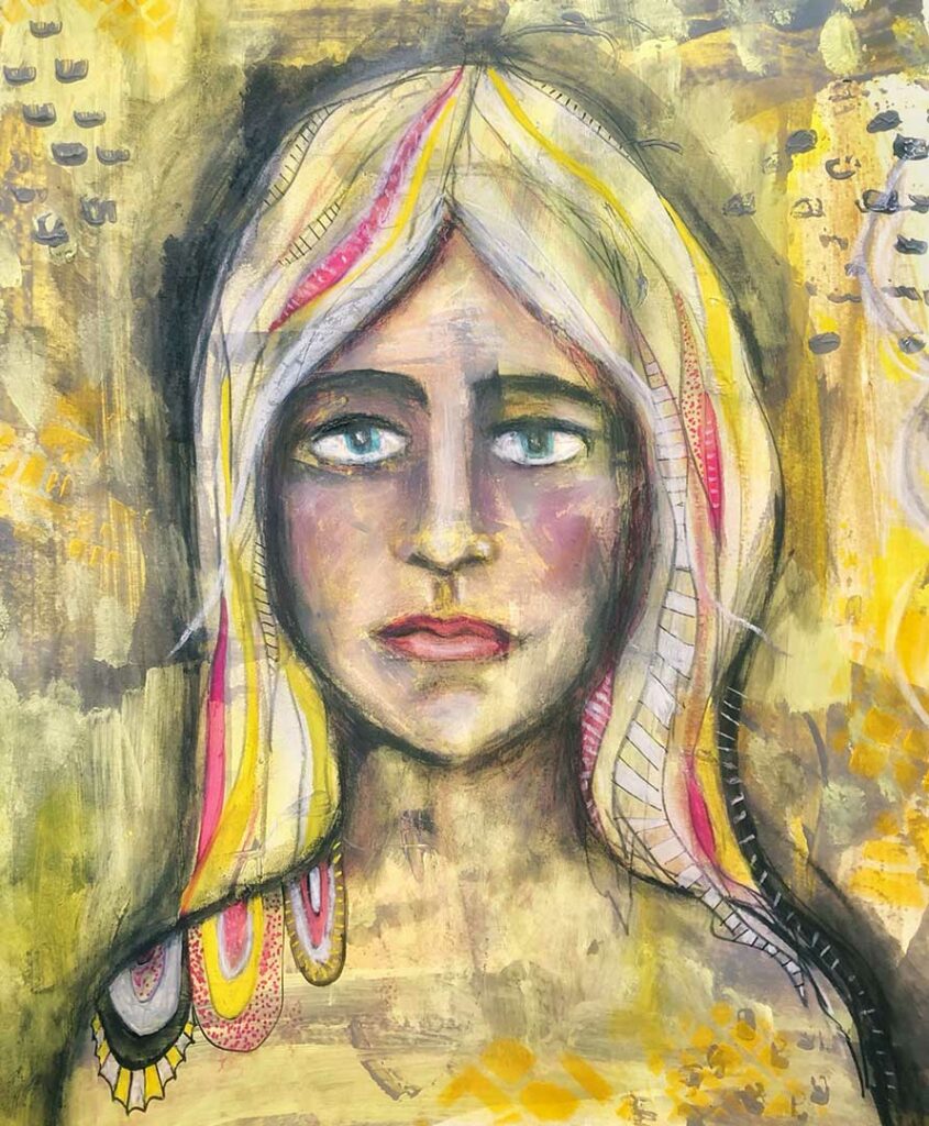
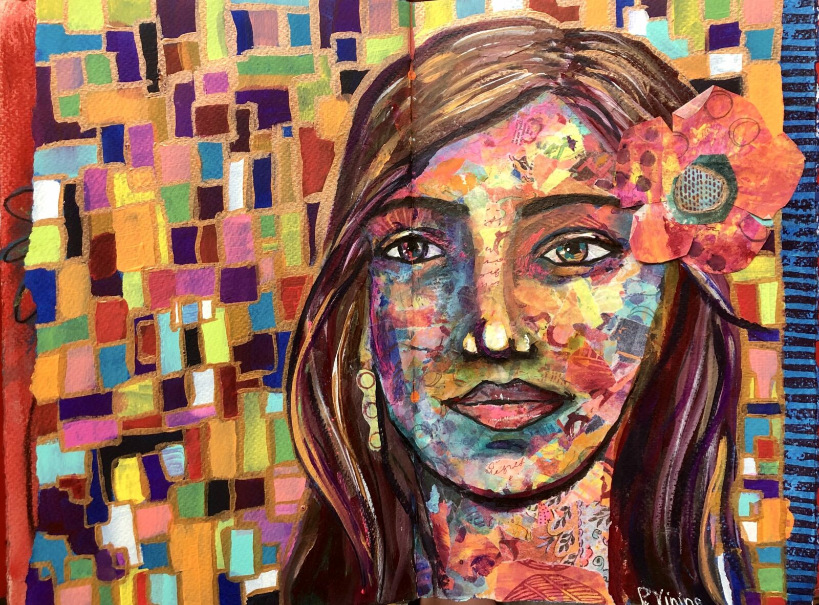
A mixed media portrait painted by EB Hawks using the Pantone colors of 2021.
We need to feel that everything is going to get brighter — this is essential to the human spirit.”
Why Two Colors?
As noted on Time’s website, “The choice to include two colors this year was influenced by the pandemic and events like the Black Lives Matter protests of 2020. After a year when social distancing became par for the course and people organized en masse across the nation to call for racial justice, the importance of connection is at the forefront of many people’s minds. According to Laurie Pressman, vice president of the institute, this essential need for relationships is mirrored in Pantone’s decision to select two colors this year, which has only been done once before (in 2016, when the institute selected Rose Quartz and Serenity as a nod to the increasing fluidity around gender norms).”
History of the Color of the Year
The goal of the Pantone Institute in choosing their colors of the year is always to reflect the culture of the moment of time we’re living in. For example, in 2020, Pantone chose Classic Blue, described by Pantone as having “reassuring qualities,” being “thought-provoking,” and reflective of “our desire for a dependable and stable foundation on which to build as we cross the threshold into a new era.” Previously, 2019’s color, Living Coral, was “animating and life-affirming.”
How the Color of the Year is Chosen
According to Pantone, “The Pantone Color of the Year selection process requires thoughtful consideration and trend analysis. To arrive at the selection each year, Pantone’s color experts at the Pantone Color Institute comb the world looking for new color influences. This can include the entertainment industry and films in production, traveling art collections and new artists, fashion, all areas of design, popular travel destinations, as well as new lifestyles, play styles, and socio-economic conditions. Influences may also stem from new technologies, materials, textures, and effects that impact color, relevant social media platforms and even upcoming sporting events that capture worldwide attention.”
But 2020 was an exceptional year that required a different approach. While the researchers at the institute usually spend the year traveling to research color trends, the health and safety restrictions surrounding COVID-19 meant their approach this year incorporated more collaboration online and a reliance on local staffers worldwide to report on trends.
Color values
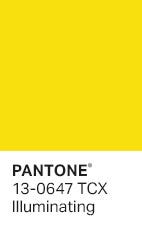
To use Illuminating digitally, Pantone provided the following values:
| RGB | 245 / 223 / 77 |
| HEX / HTML | #F5DF4D |
| CMYK | 6 / 7 / 82 / 0 |
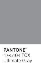
To use Ultimate Gray digitally, Pantone provided the following values:
| RGB | 147 / 149 / 151 |
| HEX / HTML | #939597 |
| CMYK | 45 / 36 / 36 / 1 |
Why Should You Care?
For over 20 years, Pantone’s Color of the Year has influenced product development and purchasing decisions in multiple industries. The color will quickly begin to dominate fashion, home furnishings, industrial design, product packaging, and graphic design.
Check out this well researched Business Insider article to see how the Pantone Color(s) of the Year “set the tone for the consumer products industry and kickstart a trickle-down effect that can last for years.”
You will be amazed at the amount of yellow and gray you begin to see as you shop in the coming months. It will dominate products, clothes, and interior designs.
As a result, you can benefit from knowing color trends. Use the color combination in your art, in your social media graphics, in your product line, in your packaging, etc… People will be drawn in, even if they don’t realize why.
So, keep your eyes open and report back on your yellow & gray sightings. In the meantime, I’m going to go paint with some yellows and grays.

