

My husband always refers to “The Idea Fairy” when I get inspired to do something, and the Idea Fairy was nearly exhausted with Andrea Gomoll’s Lifebook Week 2 lesson on making affirmation cards.
The Background
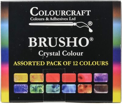 Andrea recommended we take a very large piece of watercolor paper and beautifully drop watercolors into each other so that they blossom around in an artistically pleasing way. After it dries, turn it over and do it again. Then, cut it into cards (I did 5×7 inches) and add affirmations on each one. It looked super easy. I got some Brusho Crystal Colours for Christmas that I hadn’t used. The Idea Fairy thought Gomoll’s background technique would be perfectly achieved using Brusho, powdered watercolors. Through my experimentation, I put Brusho through the paces, so here are my findings on how it mixes with various media:
Brusho Basics
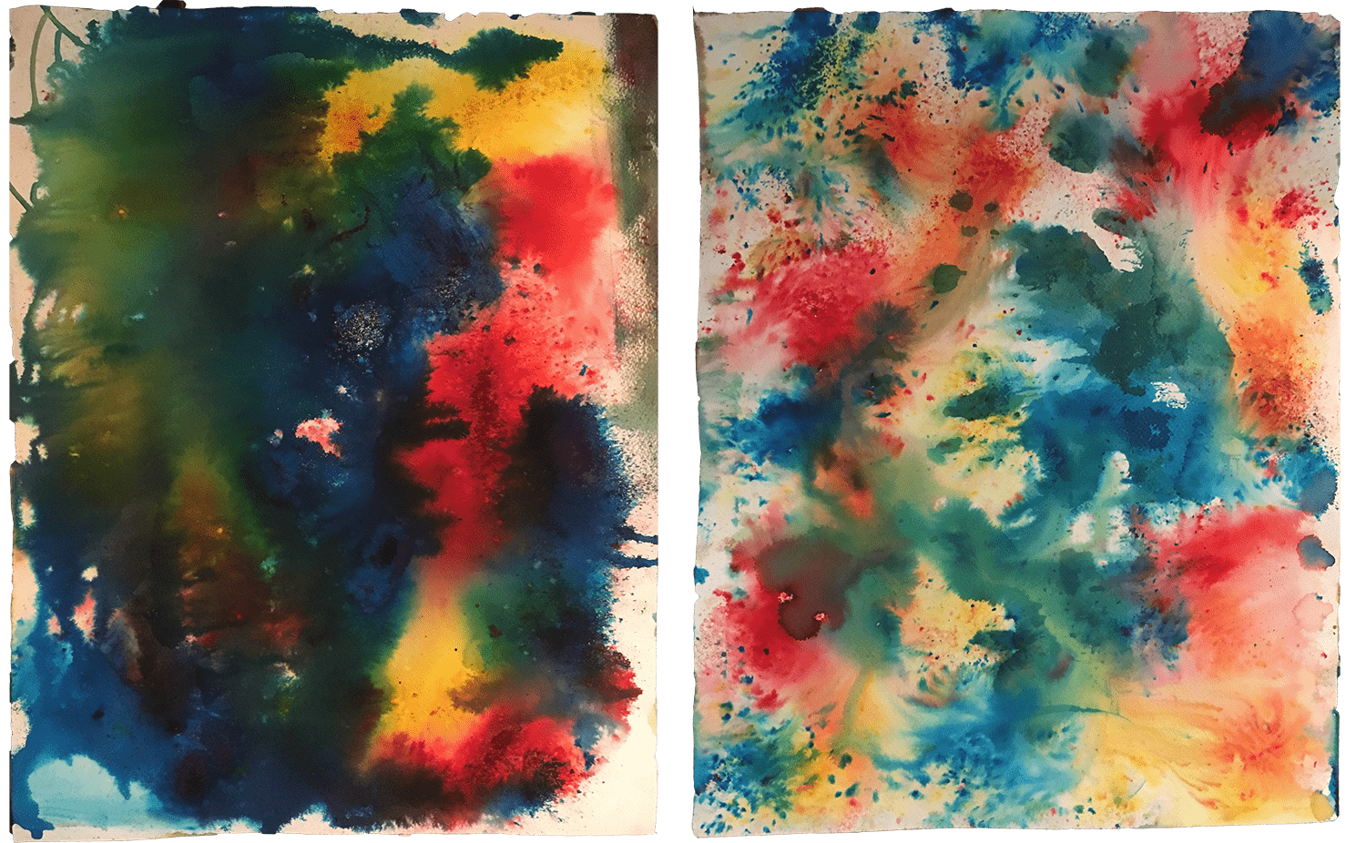
In case you didn’t know — like me — there’s a learning curve with Brusho. It’s easy to sprinkle a little too much or not enough. On the left, I spritzed some water and sprinkled it here and there. It didn’t spread like I’d hoped, so I tried to lift my paper to move it around some. It can get pretty muddy if you don’t know what you’re doing (*cough*cough*). After it dried, I turned it over and I sprinkled Brusho here and there and spritzed it with water. There was more white space than I hoped for. I’ve since watched several YouTube videos to see various application methods. I will punch holes in my Brusho lids, so I can sprinkle it out better.
Conclusion: Watch a video or 2 before attempting a background; it’s not as intuitive as it seems.
The Light Cards
Instead of focusing on making positive affirmation cards, as the lesson prescribed, I first thought I would focus on my word of intention for the year: light.

Brusho + Dylusions Inks
For my first attempt, I found a sentiment I really liked on Pinterest and used a black Sharpie to write it in the center. The Sharpie had zero effect on the Brusho and showed up really well. I then used a Faber Castell Pitt Pen to draw in the fine radial lines. Although the card was mostly warm colors, I wanted it to have even more yellow to match the sentiment, so I sprayed a Dylusions Lemon Zest Ink over the top and it cast the yellow light I was hoping for.
Conclusion: Brusho plays really nicely with the Dylusions inks and black markers.

Brusho + White Markers
Every morning I wake my kids up by saying, “It’s time to rise and shine!” I found this typographic example on Pinterest and had to recreate it. I printed it on regular typing paper and used carbon paper to transfer it onto another card. I have 2 kinds of carbon paper: graphite and black. The graphite didn’t work at all, but the black came through like a champ. I then tried to use a Posca White marker to color it in, but the Brusho inks “soaked up”. I also tried my white Sharpie and the same thing happened. My Molotow marker, however, filled it in great. For a finishing touch, I used a Tim Holtz stencil and pounced Golden yellow paint through it. It has a greenish cast, but overall did well.
Conclusion: Molotow is the best white marker to use on Brusho. Acrylics work atop Brusho. Black carbon paper works; graphite carbon paper doesn’t.

Brusho + Other Watercolors
For my champagne card, I used black gesso to paint in the bottle. I traced the type using white carbon paper (the best!). Then, I used a gold, Uniball metallic gel pen to write the words. I used my new Gansai Tambi gold watercolor paint to add the glow, shadow, and spatters. Using water, I reactivated and pulled some of the blue Brusho over stark areas. I finished it by edging it all with more black gesso.
Conclusion: Gesso, gold gel pen, metallic watercolor are all good to go.

The Universe Card
Brusho + White Paint Splatters
To me, the Brusho really made areas of the background look like a colorful NASA picture. So, the Idea Fairy took hold and I made what was ultimately my favorite card. I filled in a bottom white strip with Golden Paynes Gray paint, splattered some white around (which soaked up the Brusho colors, but still looked starry), and glued on a quote. As I glued down the white paper, the Brusho reactivated, but that helped the quote meld nicely into the background.
Conclusion: White acrylic paint soaks up the pigment, doesn’t stay white. Gel medium and Matte Medium reactivate Brusho, so a glue stick might work better for collage techniques.
The Vinyl Cards
Brusho + Gesso
I wondered if I could seal the Brusho in, so I coated a card with white gesso and then cut out some vinyl quotes. The gesso did seem to seal the Brusho; however, applying the gesso made the Brusho activate, so even the process of sealing it caused it to change. I tried clear gesso and had the same result, but the colors stayed vibrant. The vinyl stuck really nicely to the surfaces.
Conclusion: You can seal Brusho, but it will move as you apply the sealant.


Stamped and Stenciled Cards
Brusho + Embossing Powder, Texture Paste
So, then I grabbed some stamps, die cuts, and stencils to see how embossing powder would do. The Recollections snow white embossing powder I bought at Michaels atop Versamark ink stayed beautifully bright. I thought the molding paste would dry white like the embossing powder, but it soaked the Brusho pigment up like a sponge. The effect was pretty, but different than I expected.
Conclusion: Embossing powder works great. Texture paste will change colors.


Pure Typography Cards

Brusho + Markers
In the end, old faithful — aka, my Sharpie — did the trick. I made these cards with just good typography designs I found on Pinterest, some Sharpies, and POSCA Acrylic Paint Markers. The colors were vibrant and maintained a great contrast without absorbing the Brusho pigmentation. The Brusho only barely seeped up in the white marker. I even made the red splatters using the POSCA red marker. I tapped some out on my palette and used a brush to splatter it about.
Conclusion: Colored Posca acrylic paint markers work well, but not the white (see white marker section above).


The Collage Cards

Brusho + Tissue Paper
The last technique I tried was collaging white tissue paper quotes onto a couple of the backgrounds. The tissue paper disappeared into the background almost seamlessly as I suspected, but some of the type was tough to read when the Brusho soaked up to the surface. I attached them with matte medium which reactivated the color. Perhaps a layer of clear gesso between the two would prevent that. In the ‘Journey with the Stars’ card, I had to crappily trace words on the first line so they could be seen. In the Paint like a Bird sample, I had to use 3 different marker colors to achieve legible contrast, but the die cut elements lightly glued on worked well.
Conclusion: Transparent designs don’t collage well; die cut designs work well.


So in the end I have 8, front and back cards and I know a lot more about Brusho. Not all of the cards were 100% successful, but I learned a lot and I loved getting all that Idea Fairy Dust out.


1 Comment. Leave new
What awesome processes you experimented with! Thank you for sharing!